Achieve GOOD
Get Out Of Debt: Redesigning for Coverversion & Lead Generation

Overview
The GOOD app, acquired from an insurance partner, was initially designed by an agency with limited native experience. It served dual purposes:
- Act as a tool for users ineligible for our core financial products
- Generate qualified leads
However, friction in the onboarding flow and a lack of clear value propositions led to poor conversion metrics across key moments.
My Contribution
Role
Lead Product Designer
Owned UX improvements for onboarding, dashboard, and visual data storytelling
Platform
React Native
Output for iOS and Android
Company
Achieve
Formally Freedom Financial Network
Target
Underserved users and high funnel lead generation
Problem
- Onboarding was too long, with low pull-through for credit and Personally Identifiable Information (PII)
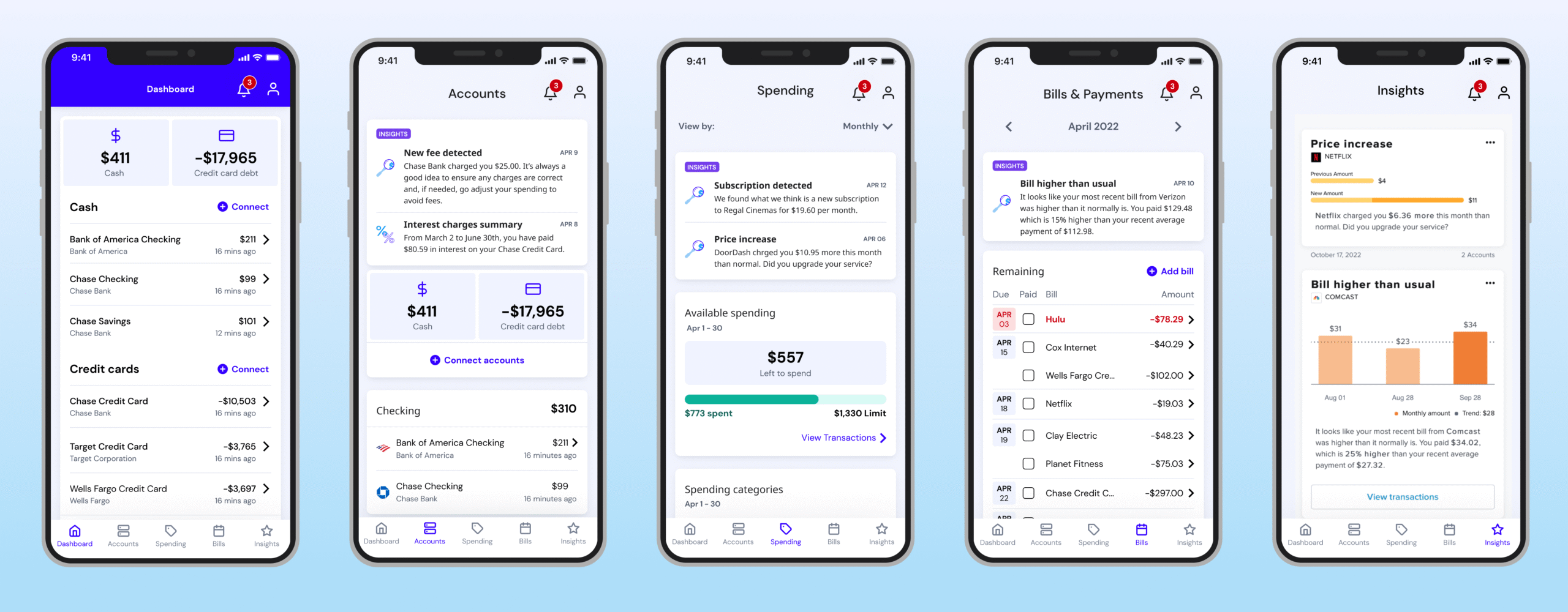
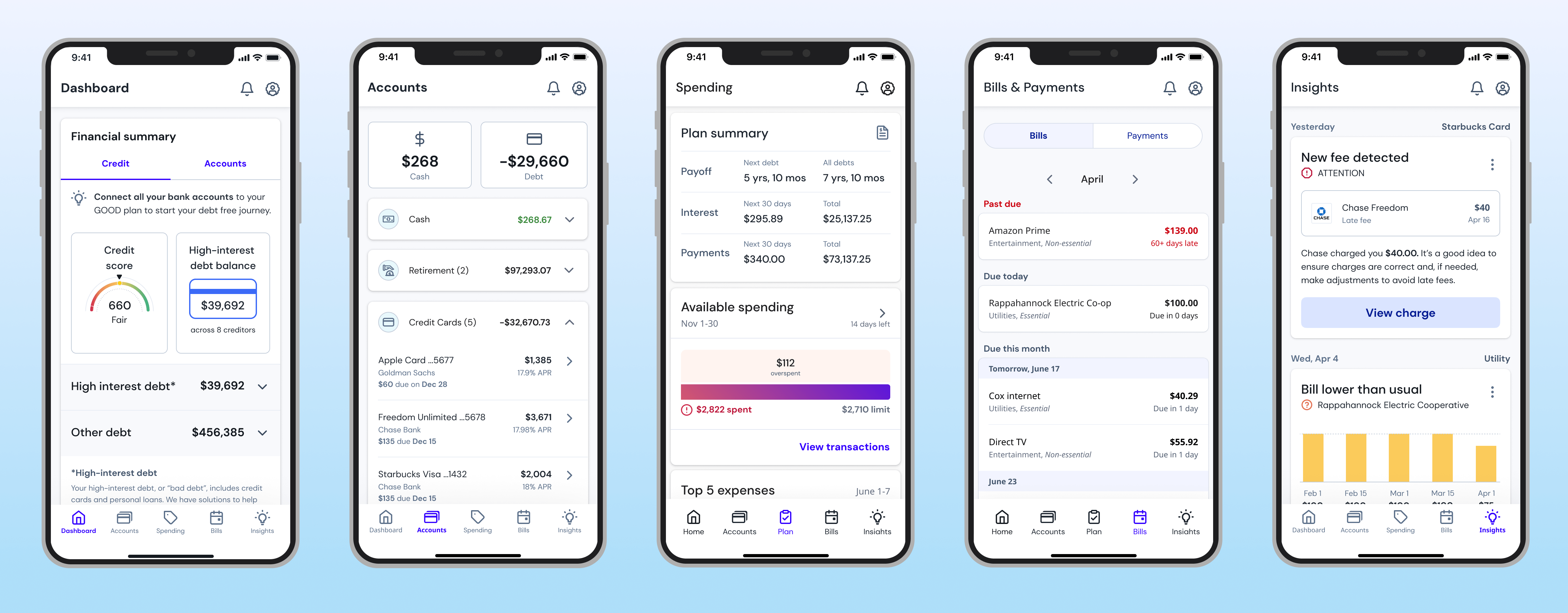
- The dashboard lacked focus, with missed opportunities in empty states
- Visualizations (like the debt growth graph) failed to engage or convert
Goal
- Increase DEX (Digital Enrollment Experience) engagement, credit pull-through, PII pull-through, and enrollment rates.
Action
Onboarding Redesign & Early Testing
- Analyzed app/web data and discovered bar graphs outperformed line graphs for debt visualization
- Redesigned landing visuals using a bar graph, tested it in place of the previous chart, and refined loading-state transitions
Data-Driven Micro-interactions
- Designed bar graph animations that flowed into credit pull and offer screens
- Created smooth transitions between screens to maintain momentum and reduce cognitive load
Dashboard & System Integration
Redesigned empty states to encourage engagement and set expectations
Integrated Spinwheel (credit data API) and prompted users to connect deeper accounts via MX
Refined how we displayed partial data while incentivizing account linkage
Results
- +200% enrollment growth after simplifying flows and removing friction
- +58% credit pull-through and +38% PII completion thanks to clearer copy and sequencing
- Lead rates doubled to 14%, with App Store reviews improving from 2.0 to 4.1
- 12% drop in onboarding abandonment, with a 12% increase in debt plan creation
- DEX completion rose to 4.4%, driven by better hierarchy, refined forms, and engaging empty states
- Design refinements included: reorganized flows, progressive disclosure, and real-time production testing to iterate quickly
- Overcame team misalignment and low morale—built trust with PMs and leadership, ultimately turning the project into a success
- Ongoing impact: The redesign remains in use today and continues to support customers seeking debt relief
Project Feedback
“Kim has consistently excelled in her role as a UI/UX designer. She is exceptionally approachable and always willing to lend a hand or share her expertise. Her availability and willingness to help team members have made a significant difference in our work environment. Moreover, Kim’s pleasant personality and team spirit have contributed to a positive and collaborative atmosphere within our team.”
~ Product Manager