Curriculum
Curious about the “why” behind a particular Design Checklist item? Got questions about dark mode? Looking for a safe space to ask “Wait what the heck even IS native, and how’s that different from mobile?”
Join us at WEEKLY NATIVE KNOWLEDGE FEST! This regular classroom + discussion series covers the fundamentals of designing for iOS and Android, with an emphasis on how native hardware, capabilities, and constraints specifically apply to how we do design at Capital One.
WHEN: 30m, Wednesdays
WHO: Anyone involved in creating experiences for EASE. Class is open to all of XD as well as friends of Design in Product and Tech.
OK, BUT DO YOU REALLY MEAN ME? Probably, yes! If you’re a native pro, come to share what you know and mentor others. Newer to native? This is a supportive space to ask all.the.questions and learn a bunch of stuff you may not know you don’t know. Leading a team of UX/UI designers but not formally a UX’er yourself? This is a great environment to develop more baseline knowledge.
WHY: Come for the camaraderie with your fellow designers and partners. Leave with more confidence and expertise to build and advocate for world-class experiences. Innovating is easier when we deeply understand the platforms we’re building on. And it’s just more fun when we get there together.
WHERE: See you on Zoom for now, friends. Snacks and fun backgrounds encouraged.
Our Approach
The Goldilocks Test, Overview
Designing “just right” learning experiences for any audience
Just in case you’re not familiar with the Goldilocks fairytale, here’s the very stripped down version: It’s the story of a little girl who invades the home of a family of bears, and tries on all their stuff: she sits in their chairs, she sleeps in their beds, she eats their porridge … until finally she finds the food or object that isn’t toooo much of this or toooo much of that, and instead suits her “juuuuust right.”
Now if you’re thinking man that sure sounds like a parable about boundaries: YES. But it’s also known for its message about balance, and that’s how we’ll use it.
We’ve been striking that “just right” zone when it comes to comprehension in our class, and we leverage these tools any time we’re explaining a complex topic to a diverse audience. confronted with a LOT of questions about how to make class valuable and ecumenical when we first designed it. There’s new content every week, and literally everyone at Capital One is welcome. As you can imagine, that’s a pretty diverse group of potential students, and the group can and does change week over week. It’s fair to say we were confronted with a LOT of questions about how to make class valuable and ecumenical when we first designed it.
To give you a sense of the diversity, here are a few screenshots from our initial class attendance surveys.
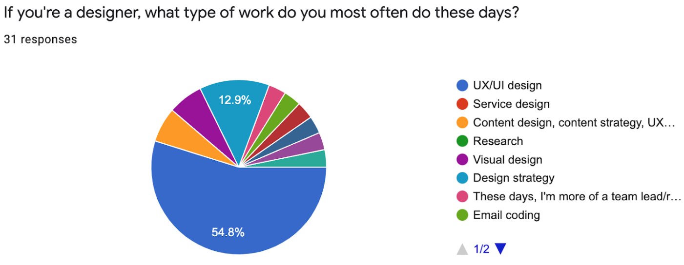
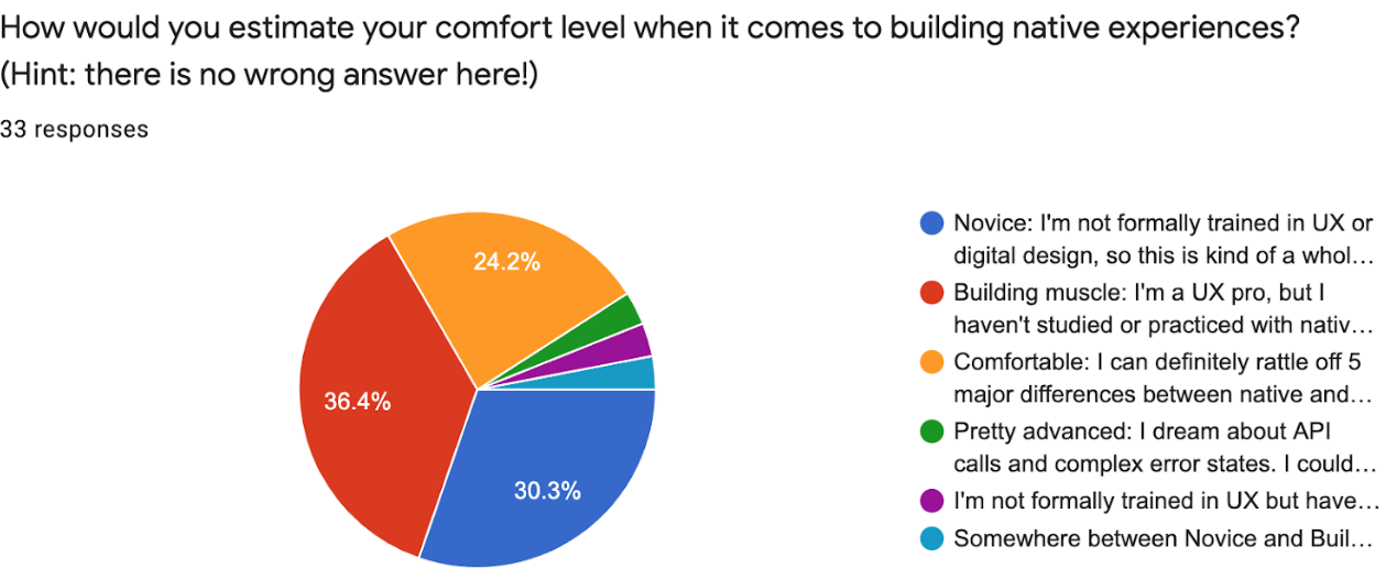
You see we’ve got Product, Tech, and a huge range of designers with wildly different backgrounds and comfort levels with native design. Now one of our top goals when designing this class was to make it as safe and inclusive as possible for as many people as possible. Why? Well, I probably don’t have to tell you things can get pretty competitive. We learned from our research that not everyone in our community feels safe admitting when they don’t know something, or asking questions in front of their peers or leadership.
We wanted people to feel comfortable asking their questions in class, especially when the subject matter gets really technical (and it does). And, because people are busy, we also wanted them to be able to drop in to ANY class, week over week, and quickly get value. So. Huge diversity of people, and we wanted them to feel great about coming. That’s a lot. Where to begin?
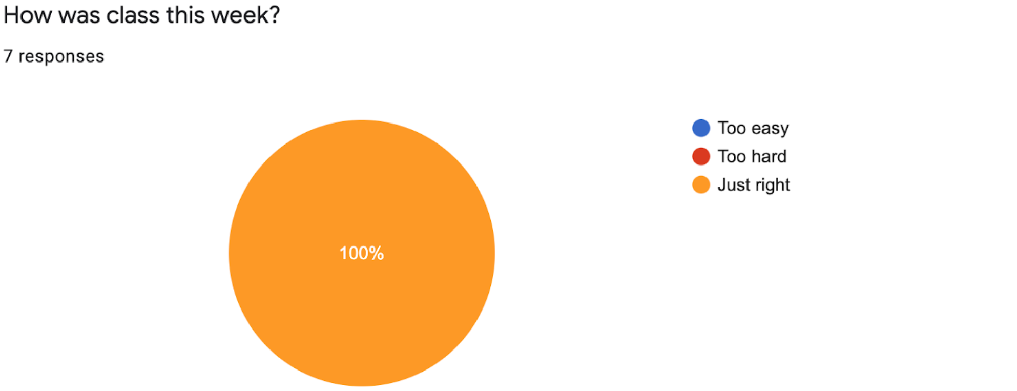
Well for the first several weeks into class, as we put out content and got to know our population, we wanted to know about ALL THE THINGS, so we surveyed our learners about ALL the things. But in time we found we needed to focus. So we shortened the class survey and just asked one thing after every session:
How was class this week? Too easy? Too hard? Or just right?
Back then, we had a hunch that nailing this question about comprehension and difficulty was foundational: Without getting this right, it didn’t make sense to tweak anything else. And we’ve been really pleased to see that after almost every single class, no matter who attends that week, our survey result usually looks like this.
So I’m going tell you our theory of how we consistently get these “just right” results on content and difficulty level. It’s called the Goldilocks test, and it’s a cluster of the storytelling principles we obsess over.
The Goldilocks Test, Implementation
The Goldilocks comprehension test is about 2 things:
- First is story: Use storytelling best practices
- The second is delivery: Remember that when telling the story, YOUR expertise alone doesn’t guarantee audience comprehension. You also need to be someone people want to listen to.
Specifically, the Goldilocks test asks us to consider 4 key dimensions of great storytelling. I’ll run through them here.
First question: Have you: CENTERED THE AUDIENCE:
- No matter how much expertise you have, rule number one in storytelling AND in teaching: your message is NOT. ABOUT. YOU.
Have you: HELD THEIR HAND
- Write this on your heart. Never, ever make your audience work to understand you. Have you heard of the usability book by Steve Krug; it’s called Don’t Make Me Think? This is that. Don’t make people work to follow you in a narrative, either.
- Be relentless about giving your audience context and making them feel secure in your story. Ask yourself over and over: Why am I telling them this at this moment?
- Use deliberate transitions, appropriate metaphors, and repetition. Repetition could feel tedious, but it’s your friend and makes your message more inclusive–it helps anyone to jump in at any point.
- Leave a trail of narrative breadcrumbs to follow, and call people’s attention back to them, within the same class and even weeks later.
- Purposefully connect the dots, and keep your promises about stuff you said you’d cover, so people don’t get lost on any detours in the middle.
- If this sounds like a lot of work for you as the speaker, you’re right. But I’m here with a controversial hot take: If someone doesn’t understand your message, there’s almost ALWAYS room for you to have explained it better.
- And I’ll go a step further and suggest that you yourself may even need to UNDERSTAND it better. Extreme? Maybe. But I promise you adopting this POV will make you a better communicator and increase audience comprehension, especially with complex topics.
Have you: EXPLAINED IT TO BABY BEAR
- Meaning: Have you designed your message for the LEAST expert among your audience? Now I didn’t say the least expert of people ANYWHERE–the I said the least expert among your audience. Designing for baby bear means taking nothing for granted and designing for your edge cases. You can always up the difficulty later: It’s way easier to do that than the opposite, and starting here will make your message and learning environment more ecumenical.
- What does designing for baby bear look like?
- Unpacking jargon and avoiding inside jokes.
- If you’re about to base a whole lecture on a single concept, take just a minute to explain its context or history, even if you think 7 out of 10 people in the room know it
- If you need some perspective, prototype or practice your talk with someone who fits that profile.
And the last Goldilocks check: Have you BEEN ACCESSIBLE AND HUMAN IN YOUR DELIVERY
- To aid in comprehension, write and teach how you talk. Anything less than this will come across as inauthentic at best — and at worst, opaque.
- Being accessible is also about remembering to vary the interaction model often (meaning switch it up from lecture to hands-on learning).
Goldilocks in Action
video coming soon
Feedback
“It was awesome! Learned a lot in just 20 minutes.”
“This was really useful to me, hoping this can be longer.”
“I was vibing with all the material and felt like it just wasn’t long enough to cover everything. It was amazing though! I can’t wait for the next class! ^-^”
“I like the analogies and imagery – especially Adam Hillman’s assemblage work! Looking forward to getting into more detail.”
“The class was great! It was presented in a very interesting and fun way. Learned a lot about design differences between iOS and Android.”
“Just wanted to let you know I’ve come to your WNKF since my first week here at C1 this March. You have helped me SO so much and all the wonderful knowledge aside, I just appreciate how genuine you are as a person and colleague.”