Overview
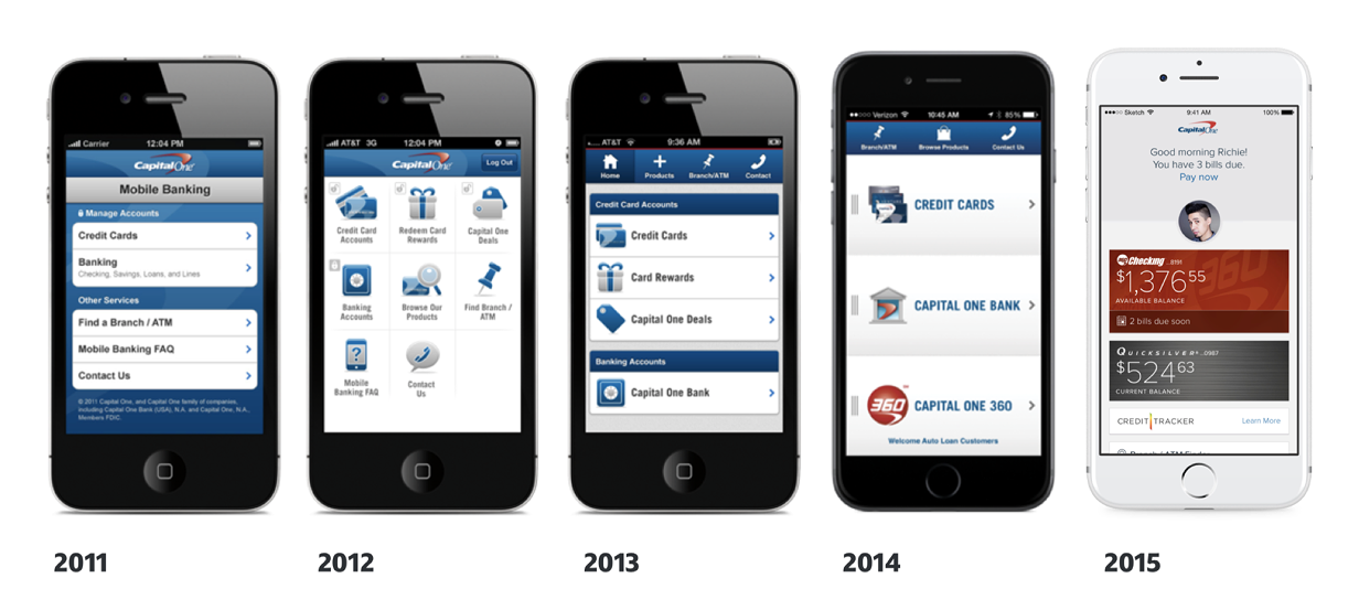
From 2011 to 2014, Capital One’s account servicing app was an HTML-based experience wrapped in a native shell, one app for all platforms. While functional, this app was slow, cumbersome, and failed to fully leverage device capabilities. As Capital One acquired businesses like HSBC and ING Direct, backend systems remained siloed, creating fragmented products with separate logins for different account types, credit cards, banking, and checking.
In 2014, Capital One decided to overhaul its mobile strategy, investing in fully native apps for both iPhone and Android. This marked a significant shift towards a tech-driven future, and a multidisciplinary team, including myself, worked together to design a truly modern mobile experience. My role was to lead the design and development of the Android app, with a focus on money movement features, account integration, and user flow optimization.
Problem
Goal
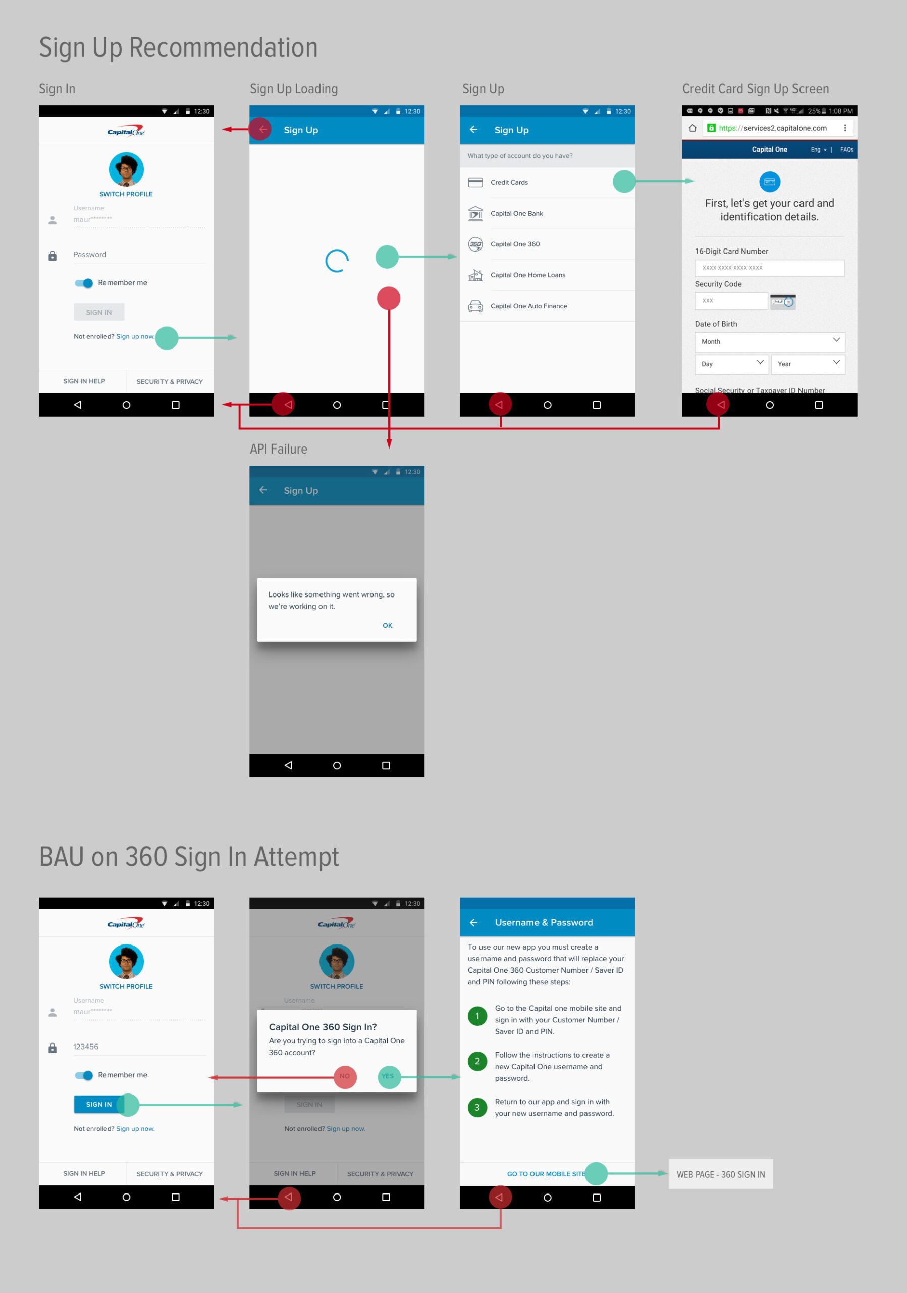
The primary challenge was to consolidate multiple product logins and create a unified servicing experience. Prior to the redesign, users had to manage multiple logins for different Capital One products, leading to frustration and a fragmented experience.
The goal was to enable a singular login that would provide a consistent user experience across all Capital One products while still maintaining product-specific branding and functionality. Additionally, the app needed to leverage device capabilities to create an intuitive and seamless experience, specifically tailored for Android.
My focus was on designing a consistent, unified experience where users could effortlessly shift between accounts without friction. The design needed to adhere to Android platform norms while still aligning with the overall Capital One brand.
Key objectives included:
- Enabling singular login for all products.
- Ensuring a consistent user experience across all account types (credit cards, banking, checking).
- Leveraging Android-specific design patterns to optimize user interaction with device capabilities, delivering a native, intuitive experience.
Research & Discovery
While research and discovery were primarily handled by an earlier team, their work laid a critical foundation for the design process. This included developing the Total Addressable Market (TAM), creating personas, conducting competitor analysis, and exploring UX concepts with a focus on accessibility and regulatory requirements.
Several participants mentioned preferring Android because it wasn’t an Apple.
~ 5.X Empathy Study
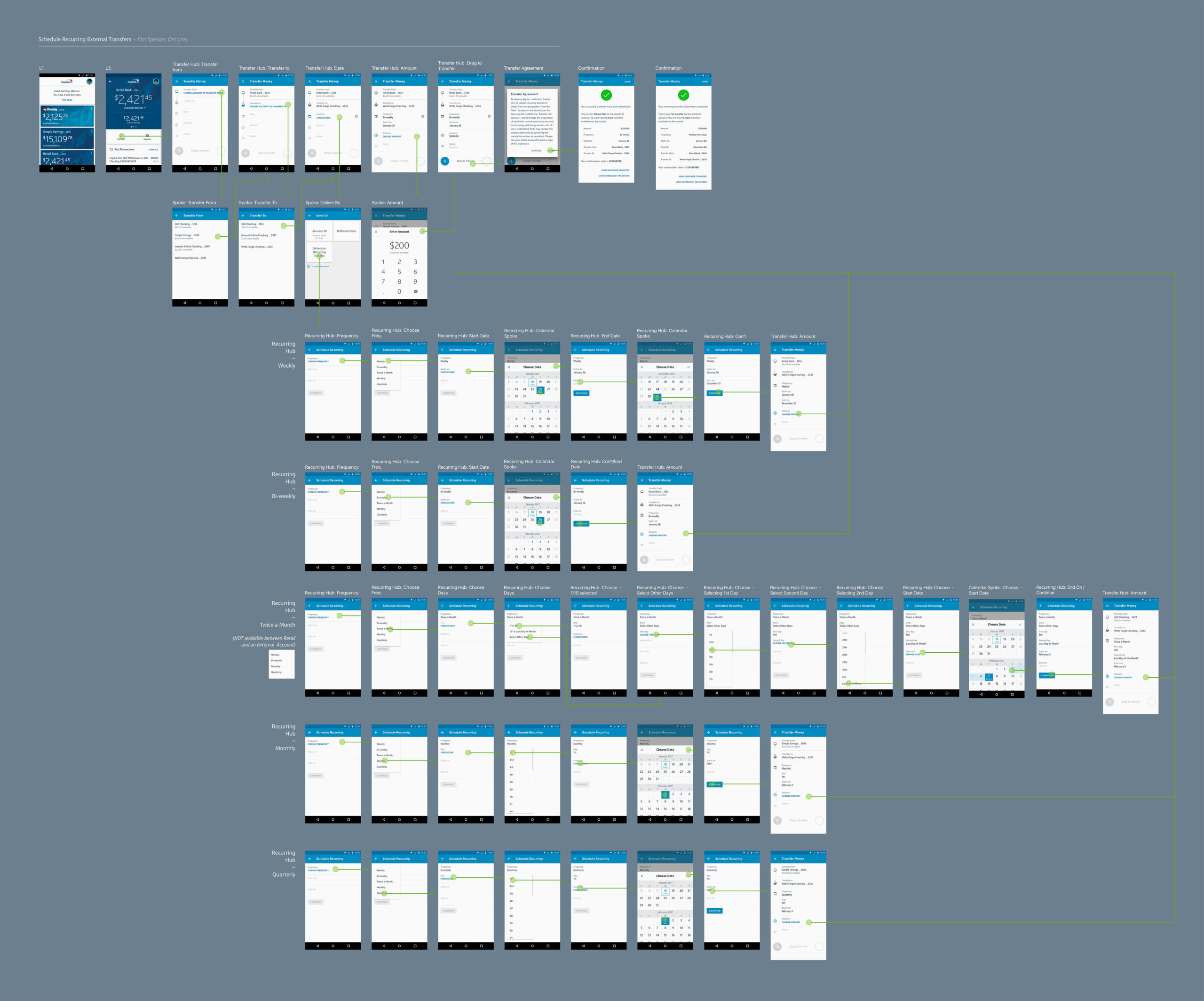
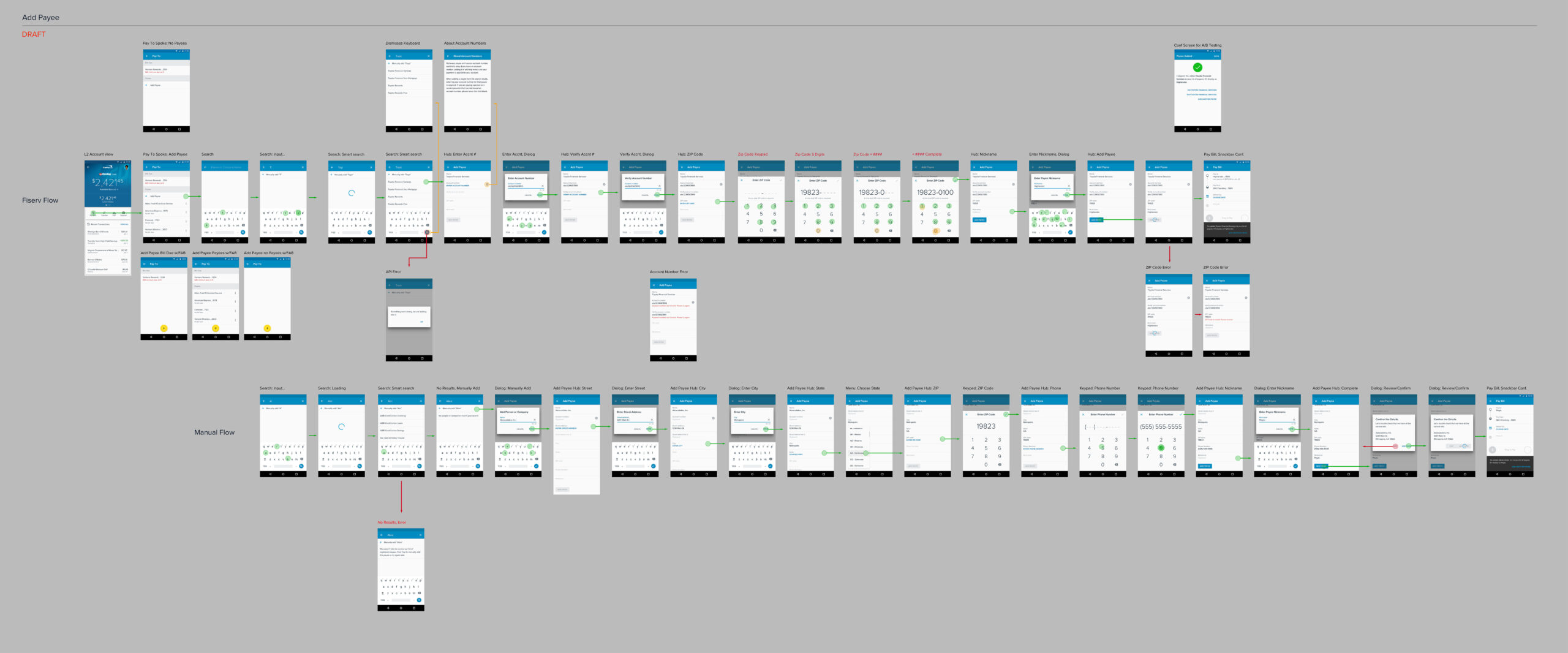
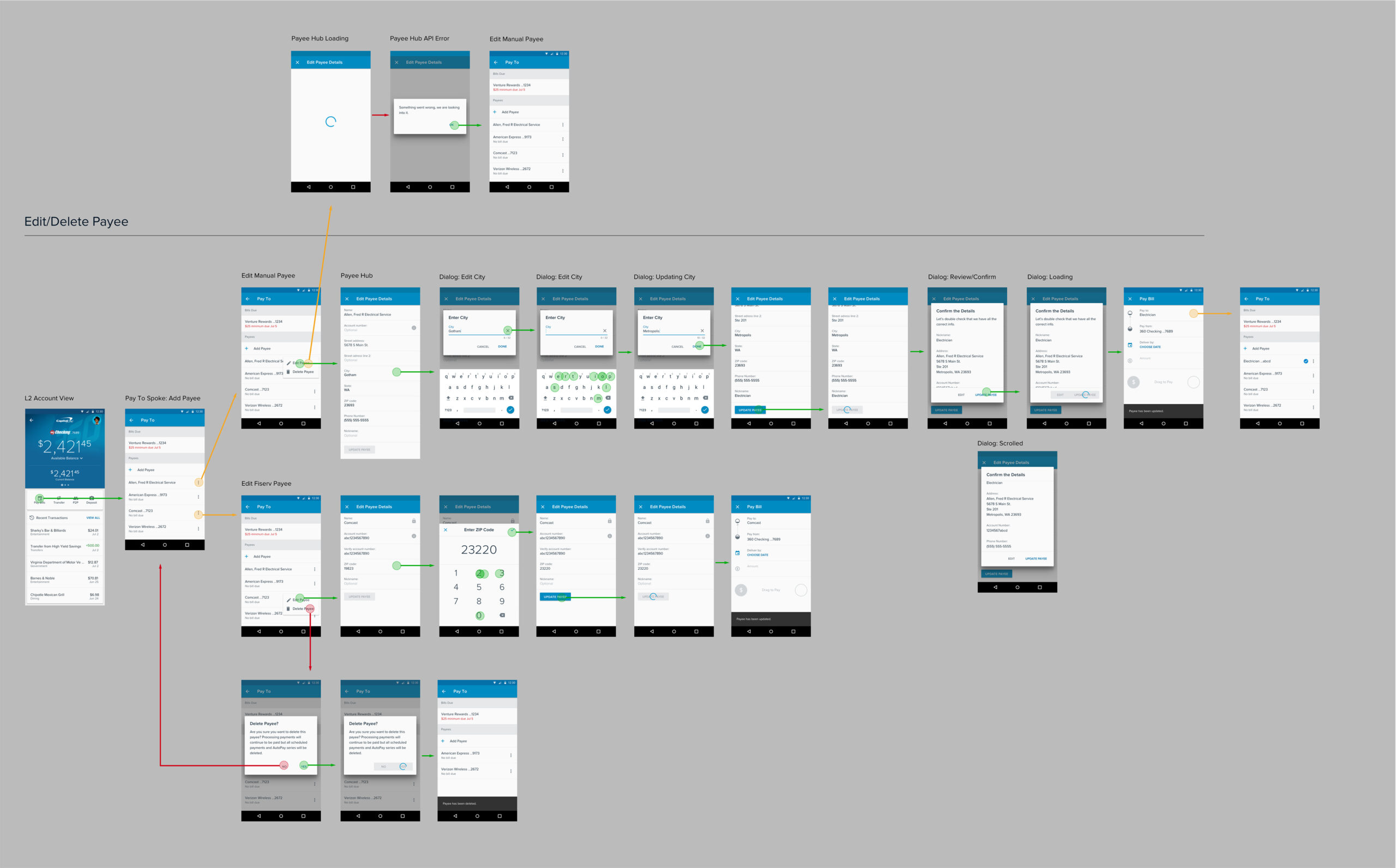
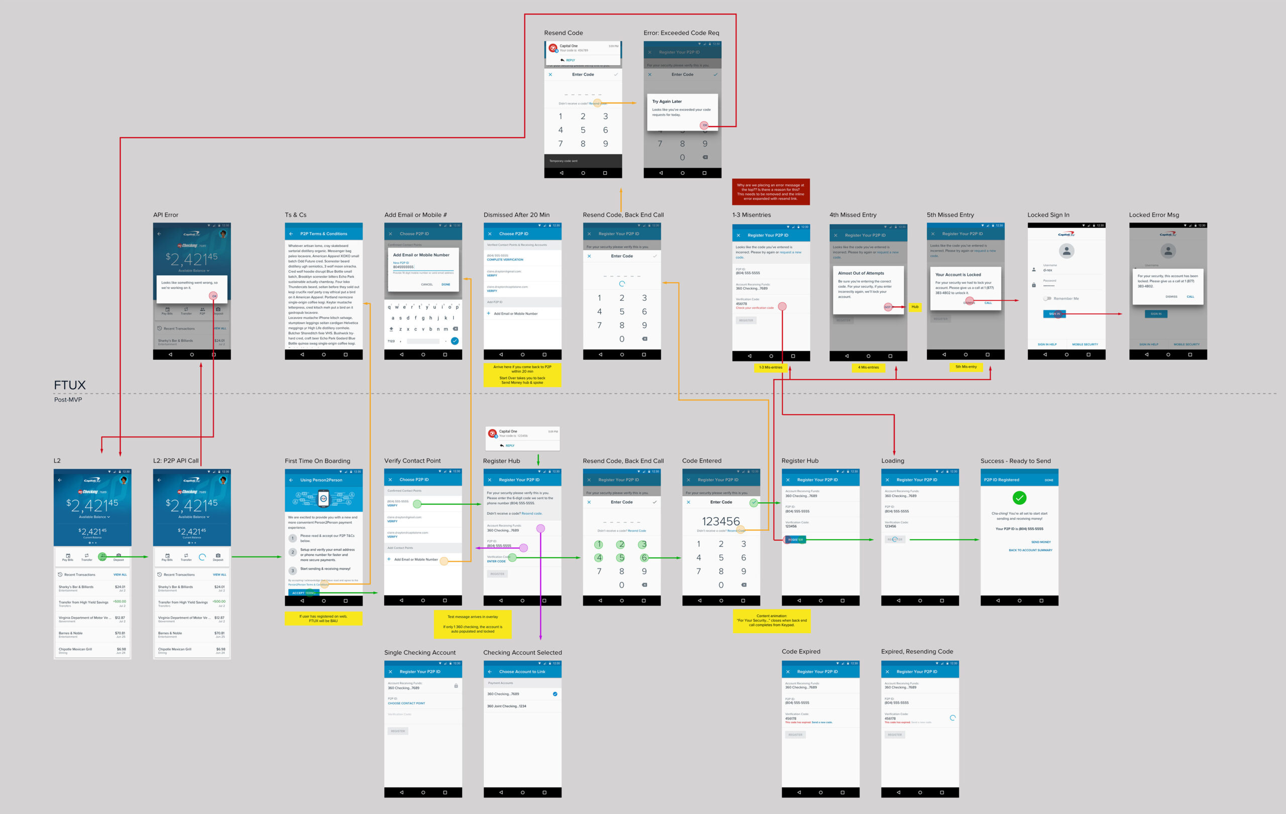
Based on these insights, the team arrived at the hub-and-spoke model as a core design principle, which consistently outperformed other approaches during testing.
As I joined the project, I took these findings and focused on implementing the design for the money movement feature, ensuring seamless integration across the app and creating an experience that was user-centric and platform-appropriate on iOS and Android, along with research on organization and clarity.
Ideations & Wireframes
Diving into the World of Android
As we kicked off Android development, I split my time between teams in Wilmington, Delaware, and Northern Virginia, building trust and momentum through in-person collaboration.
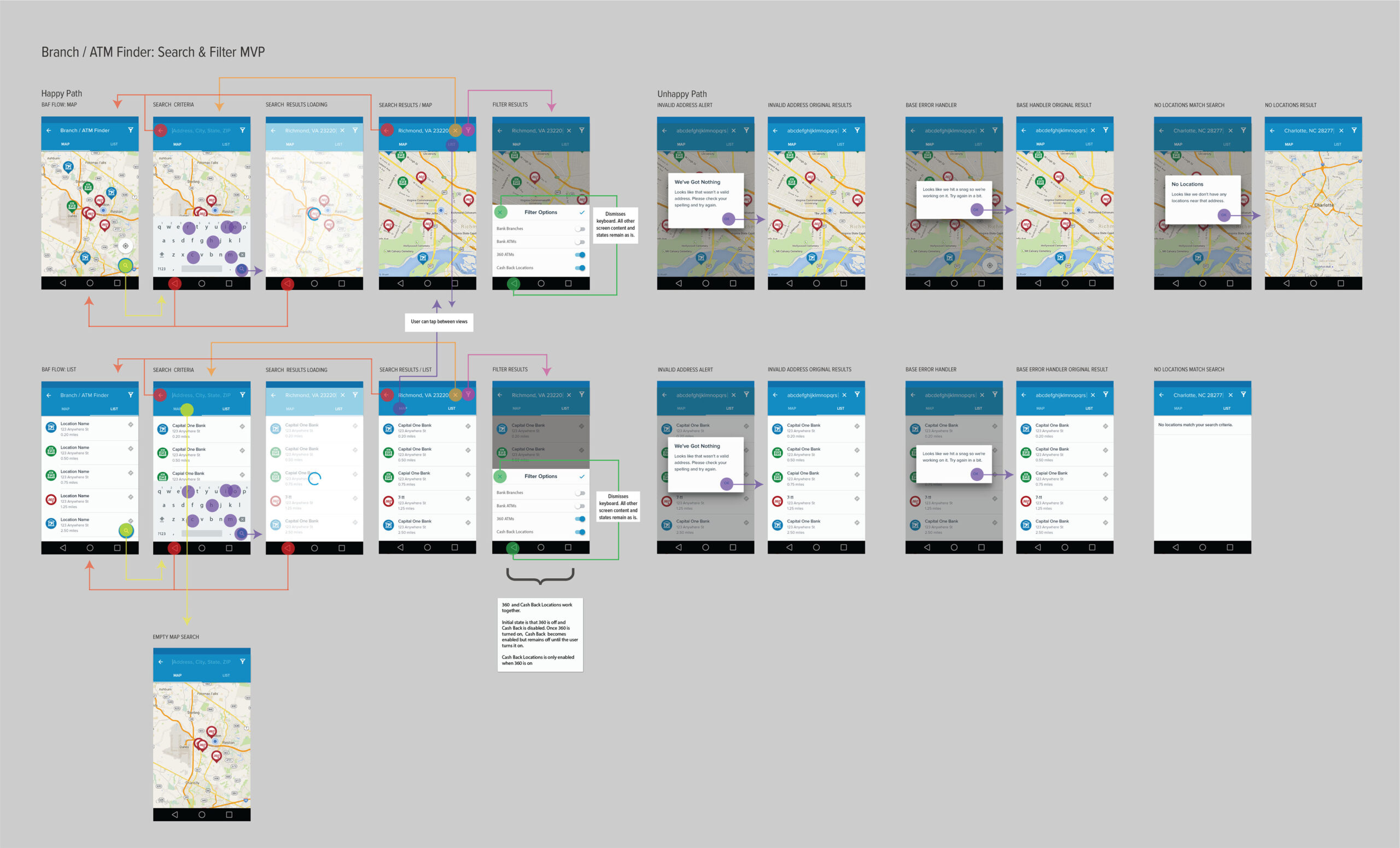
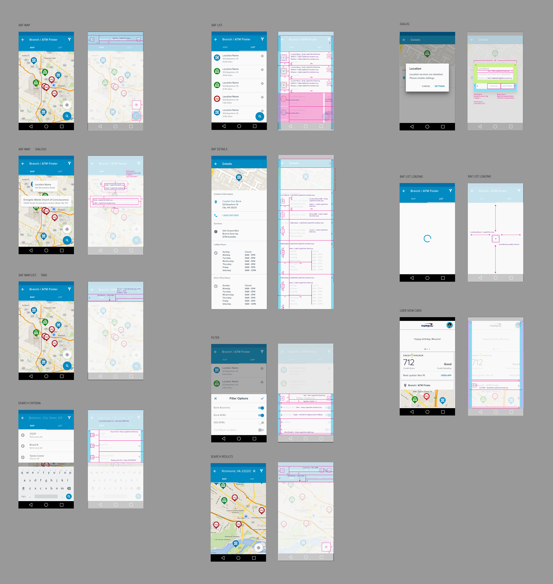
My first flow tackled the Branch/ATM Finder, a tile on the Accounts screen. It needed to accommodate multiple ATM types (e.g., cash-only vs. deposit-enabled), allow users to view locations in map or list view, and surface hours and directions.
This work was built on Google’s newly released Material 1.0. At the time, there were no automated tools for redlining, so I produced all handoff artifacts manually. I partnered closely
with our PM and tech lead to refine flows and polish edge cases, then created redlines for final delivery.
Looking back, I made an early mistake: I placed a tab bar on a screen with a map, a combination that proved confusing in testing. That experience shaped how I evaluated design patterns moving forward and reinforced the need for platform-native thinking.
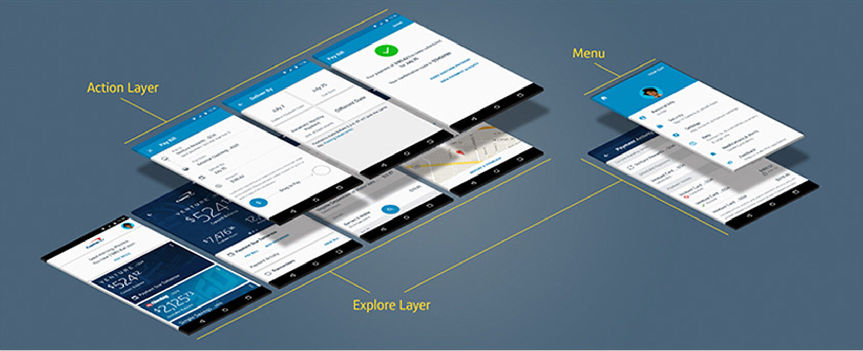
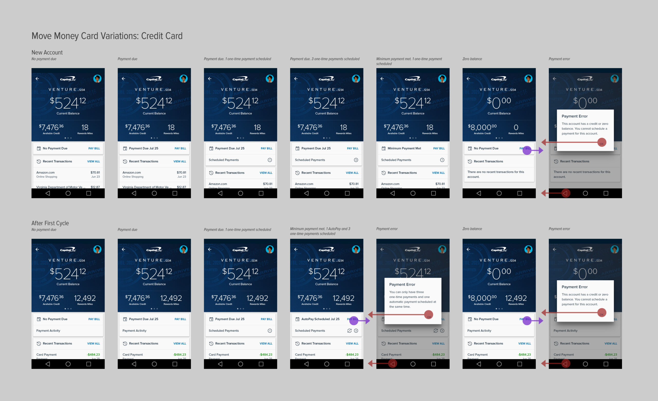
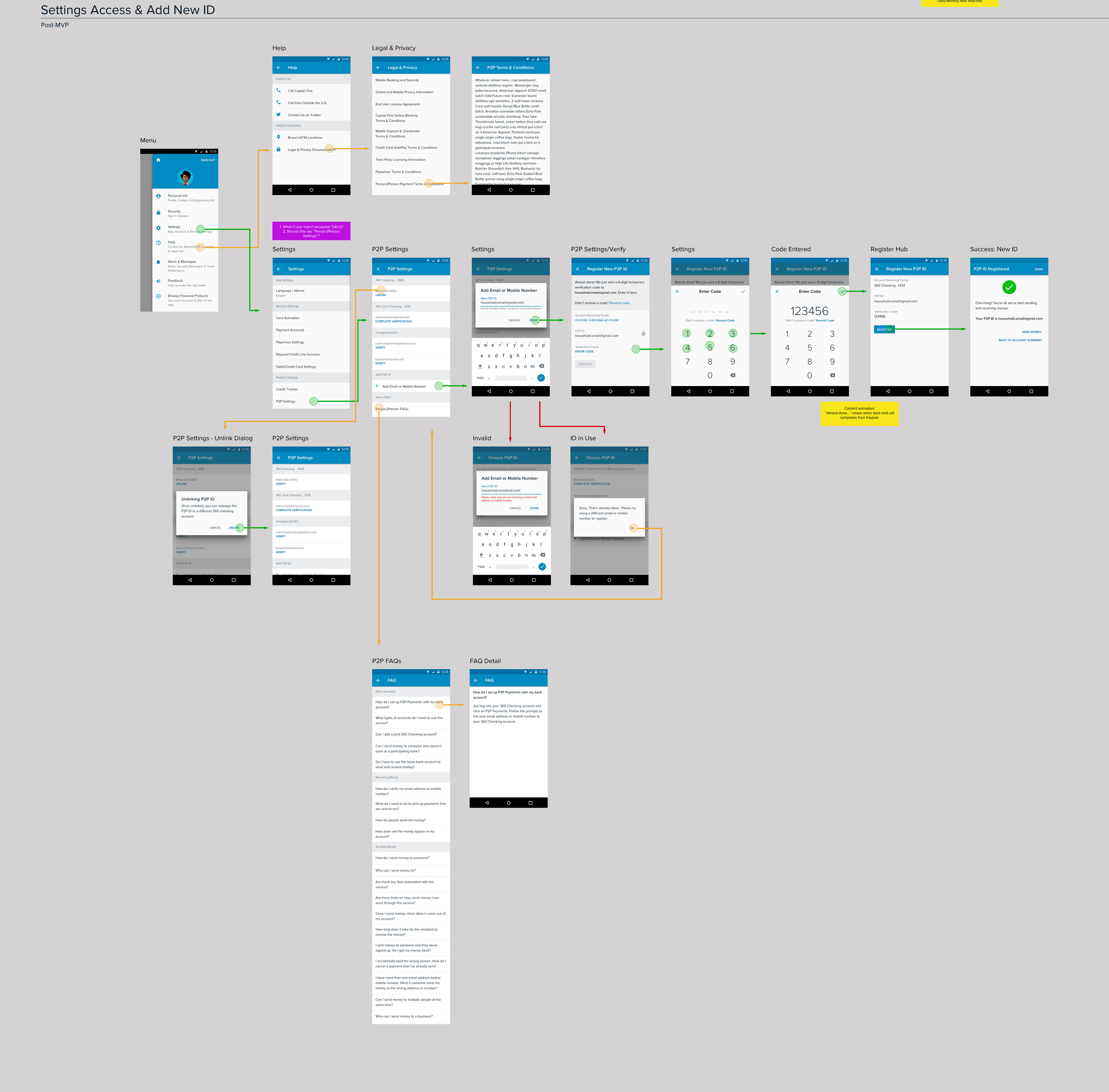
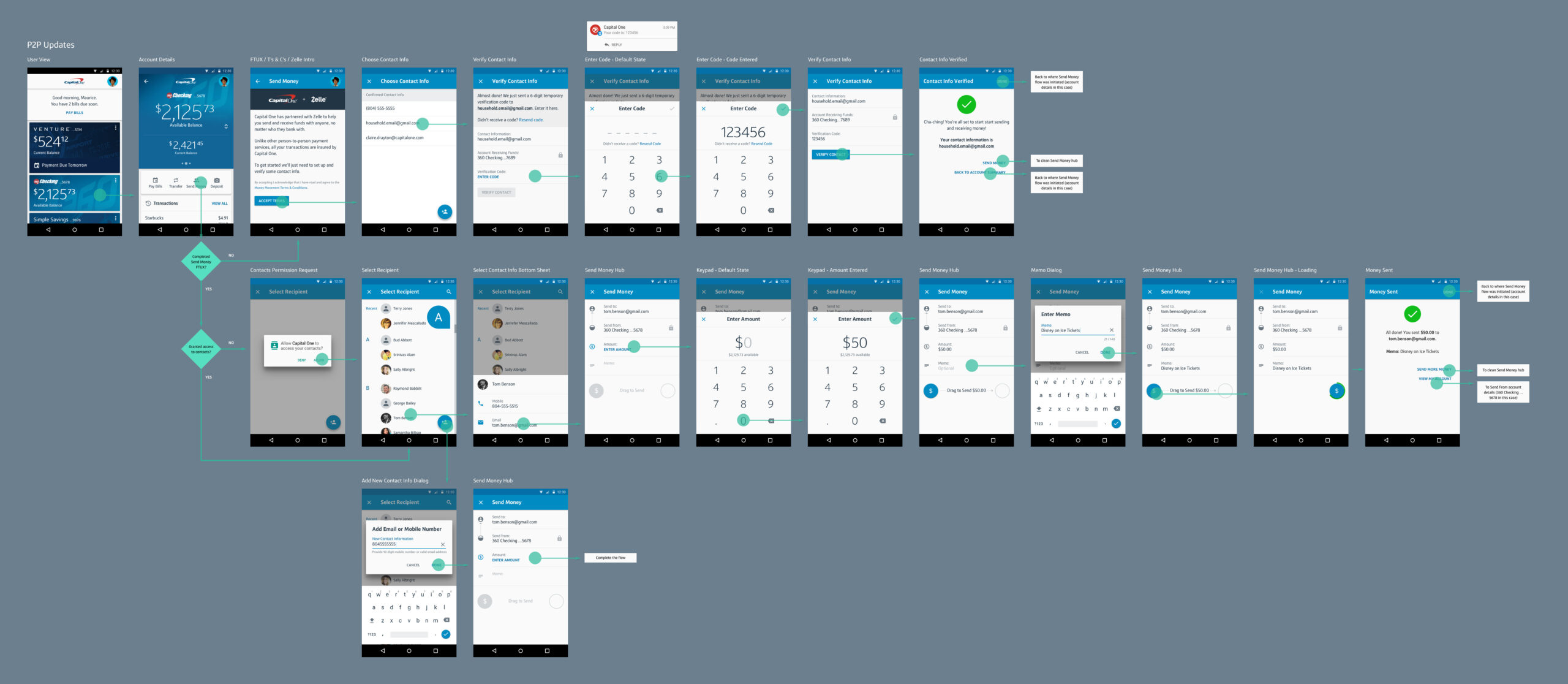
This flow also led to the creation of our “Action Layer”, a visually distinct layer (anchored by a cyan app bar) that sat on top of the product-branded “Explore Layer.” The Action Layer became a key organizing principle for money movement and other account-agnostic flows, giving users clarity while preserving product identities.
Usability Testing
Gorilla Research in the Food Court
Before Capital One had formal research labs, we got scrappy. Our office in Northern Virginia sat next to Tysons Corner, one of the busiest malls in the region and a perfect spot for real-time user feedback.
In pairs, we’d head to the food court: one person would recruit participants with a Starbucks or Amazon gift card, while the other ran the session. Depending on the fidelity of the prototype, I’d bring either a test device or simple black-and-white printouts.
These quick sessions helped us validate flows, uncover friction, and gain perspective outside the walls of our design studio. When I began refining money movement patterns, this method became a go-to strategy.
As the research function matured, I transitioned to using our dedicated research labs for deeper usability testing. But those early mall sessions were critical, they kept us humble, fast, and user-focused.
Visual Design & User Experience
Designing for Delight and Clarity
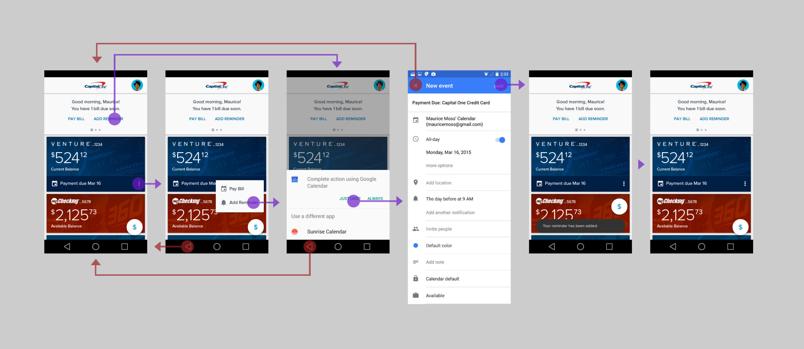
The app had to support everything from quick tasks to highly complex flows. On the simple side: setting a calendar reminder for an upcoming due date. Android didn’t enforce a specific calendar app, so I designed a lightweight selection pattern that respected user choice without breaking flow.
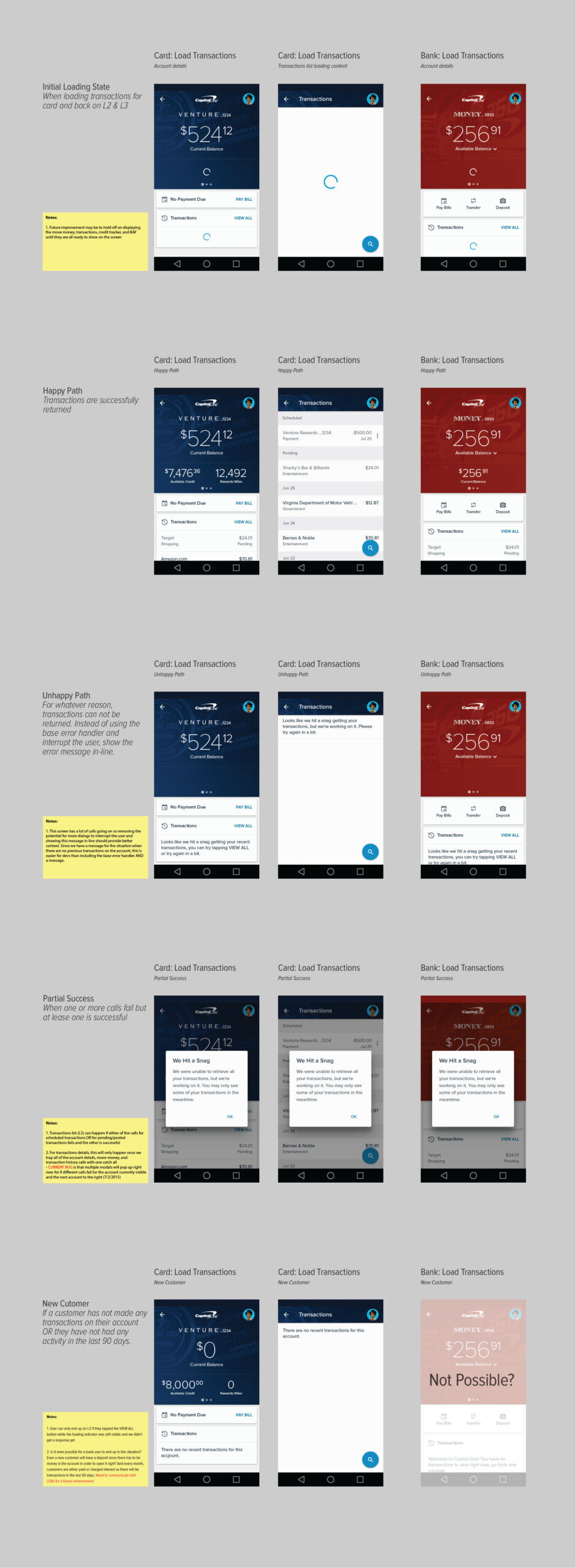
More complex challenges, like users with both Retail and 360 Checking, required careful UX scaffolding to ensure clarity and minimize confusion during account transitions.
Motion and Microinteractions
Material 1.0 shipped with foundational principles but few actual components. That left room to play. I partnered directly with engineers to design custom transitions and microinteractions, moments of motion that communicated progress, reinforced hierarchy, or added just a touch of delight.
Sitting with developers was essential. We tuned the pace, weight, and rhythm of animations together until interactions felt natural and consistent. Motion wasn’t decoration, it was a tool to make the experience feel intuitive and fluid.
A Layered Model
To manage complexity and create a clear mental model, I introduced an “Action Layer” with a distinct cyan app bar. This layer floated above the product-branded “Explore Layer,” allowing us to support task-based flows, like finding an ATM or transferring funds, without disrupting the core account experience.
Microinteractions
Addressing transition or task animations was always a fun distraction and an opportunity to bring a touch of delight to the user experience. Material 1.0 did not include animations in its provided components, so I worked directly with developers to apply Material’s motion principles, defining the action, scale, and pace.
During these projects, sitting with the developers proved invaluable in fine-tuning interactions, ensuring that animations felt smooth, intentional, and aligned with the overall experience.
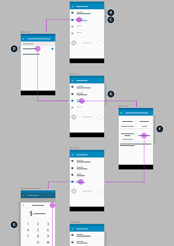
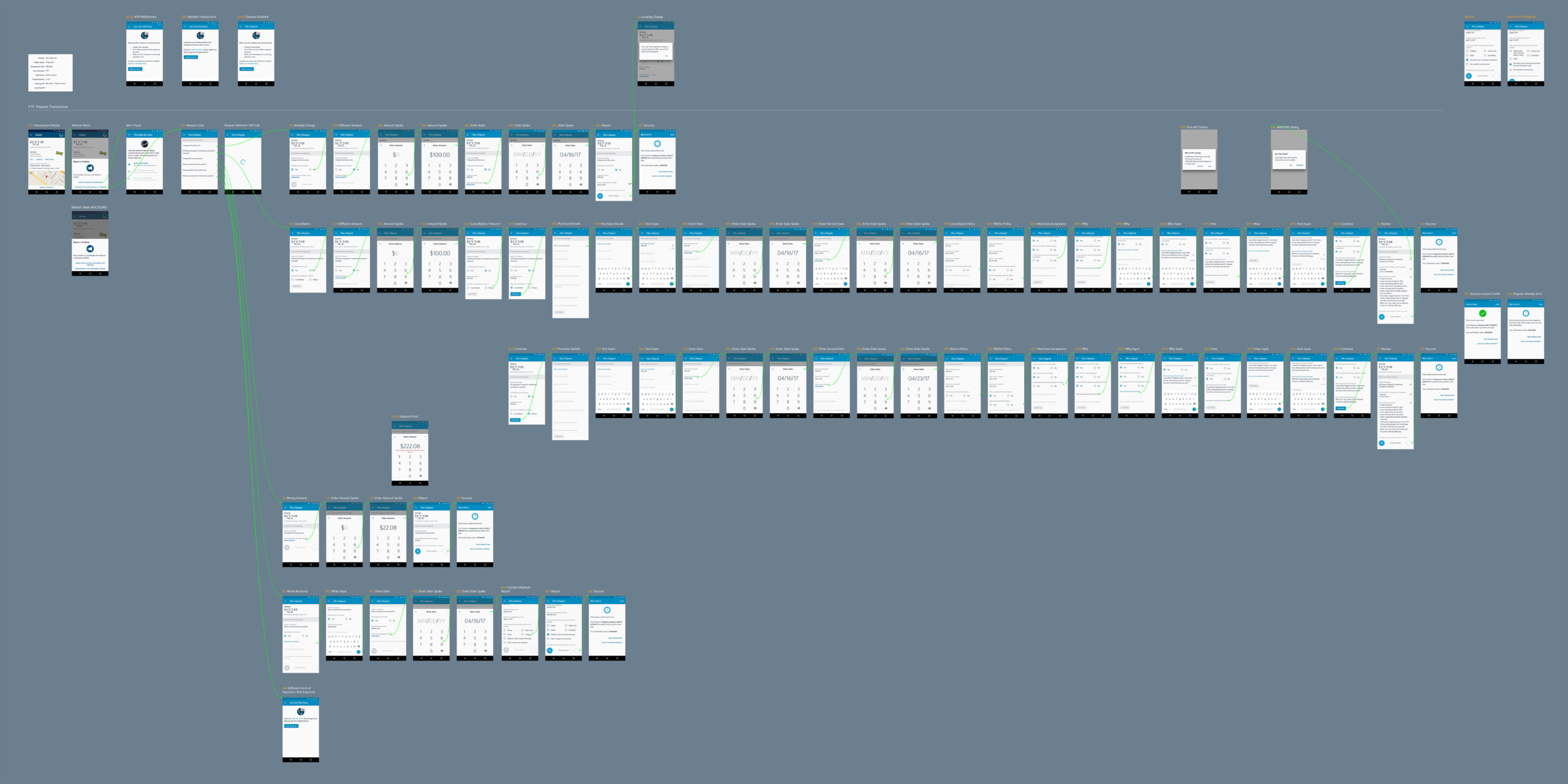
Complex Flows
Guiding Users Through Heavy Lifts
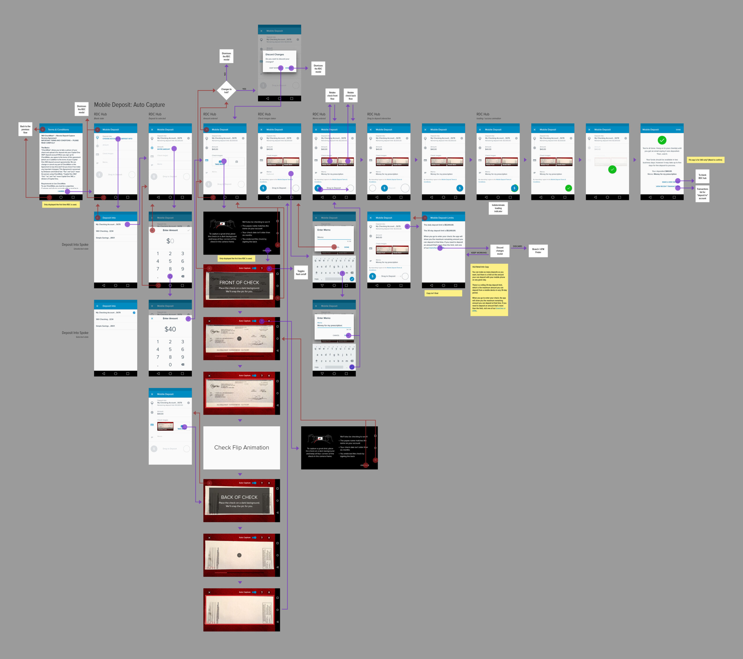
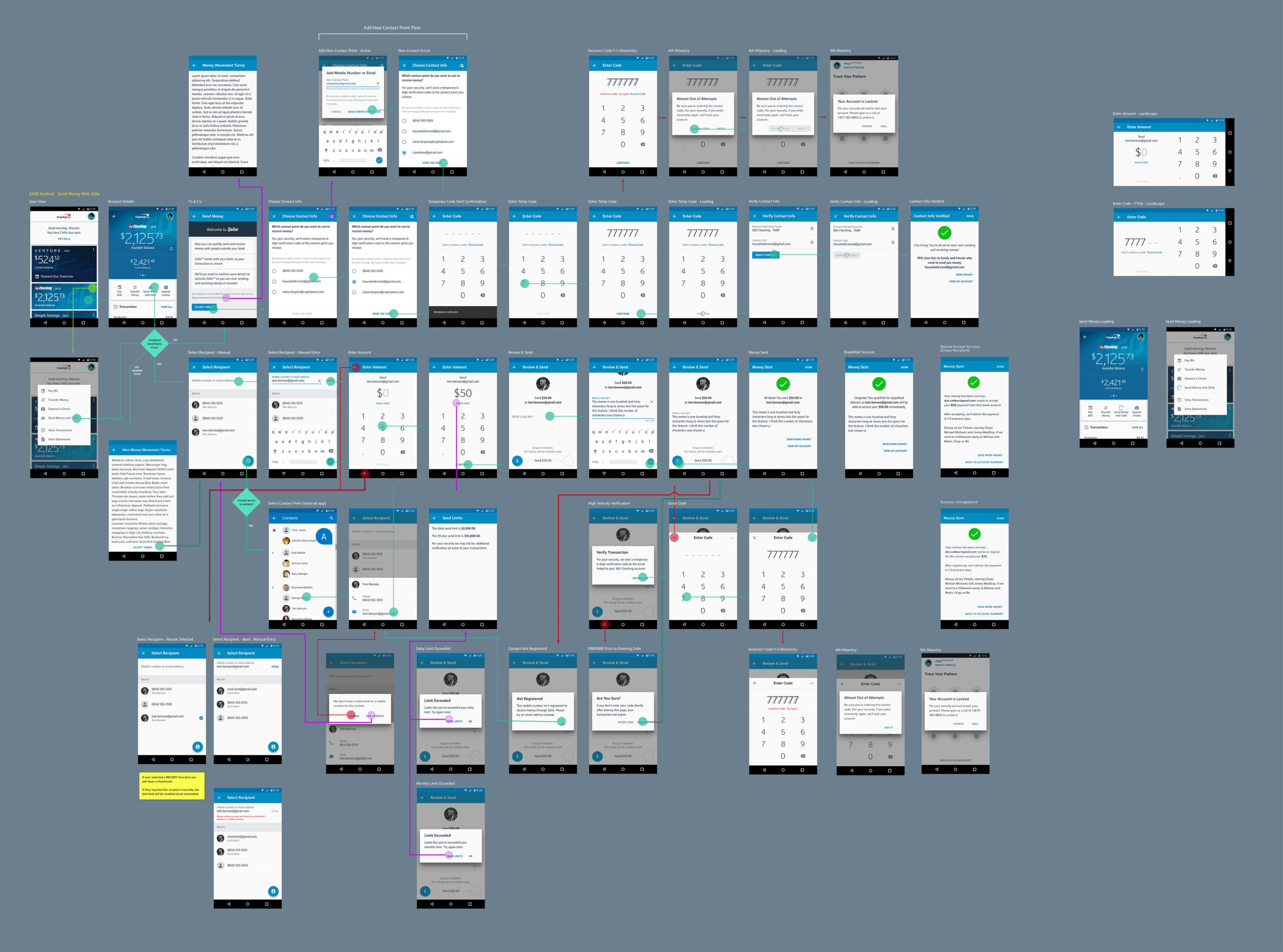
Not every interaction was quick. Some flows, like transferring large sums, paying off multiple accounts, or reporting fraud, required several backend calls, dynamic field states, and legal compliance. Others were lengthy simply because the user needed to review and confirm lots of information.
The hub-and-spoke model proved critical here. It kept users anchored in their journey, even as the UI adapted step by step. Inline edits, summary screens, and preview options helped users feel in control without getting overwhelmed.
My goal was to make even the most complex tasks feel seamless, trustworthy, and confidently executed, no matter how much was happening behind the scenes.
Balancing Brand Integrity with Partner Integration
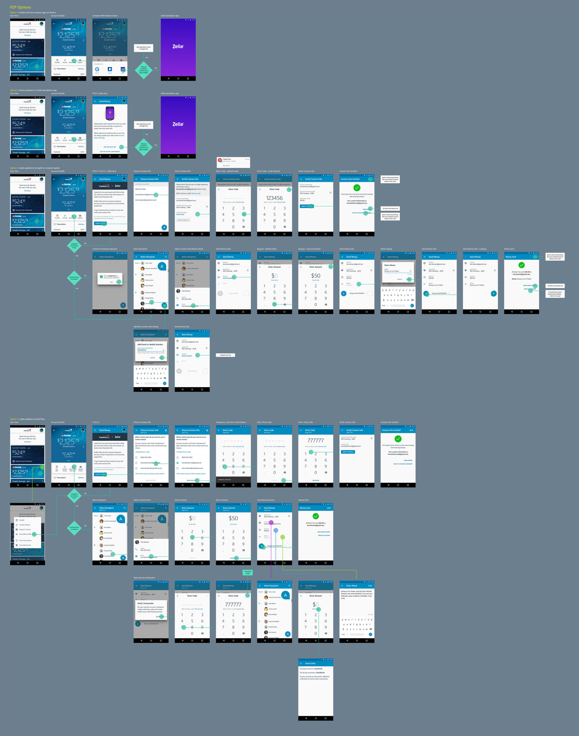
Capital One already had a working person-to-person payment system, but we were exploring improvements—like allowing users to choose their preferred app (Cash App, Venmo, etc.). Then Zelle® entered the picture.
We were told:
- We had to use Zelle.
- It must be embedded within our app.
- Users would be auto-authenticated.
But their experience didn’t align with ours—different fonts, styles, interaction patterns, and a rigid serial flow. I reviewed
their prototype and brand guide and compiled a detailed, 10-page document outlining usability concerns, visual inconsistencies, and gaps in key scenarios.
Leadership’s response:
“Pull together a version that incorporates it into the app, and we’ll go from there.”
So I did. I blended Zelle’s required structure with our standards—adapting their linear approach, modifying UI elements to match our design language, and ensuring the experience felt integrated and Capital One-authentic.
Development
Scaling Craft and Collaboration
I was fortunate to work with outstanding product partners and tech leads, our team operated like a well-oiled machine, collaborating daily to bring the experience to life.
In November 2015, we launched the Capital One Android app to 6.5 million users. By summer 2017, it became a major contributor to company revenue, helping drive over $7 billion annually.
As momentum grew, so did the team:
- Designers: 2 → 5
- Development teams: 4 → 10
- Locations: Virginia, Delaware, Richmond, and San Francisco
I supported multiple cross-functional teams across these sites, ensuring design consistency, enabling reuse through component libraries, and sharing knowledge across time zones and teams.
Outcomes & Results
When Things Go Wrong
In June 2017, the Capital One Android app earned its first of several J.D. Power Awards. The app received excellent reviews in the Play Store and was instrumental in driving customer satisfaction and engagement. It played a key role in contributing to Capital One’s digital growth, supporting over $7B in annual revenue.
As our impact scaled, so did our team structure. In 2019, the flagship mobile team was restructured and federated, transferring native design responsibilities to line-of-business designers who had previously focused on web. This shift created a knowledge gap around native patterns and platform conventions.
To bridge that gap, I reworked and expanded the Android Design System Library:
- Consolidated edge cases and product-specific variations
- Restructured the system to improve usability and onboarding
- Made it easier for designers to build native-first experiences with confidence
When Friction Teaches Us Something
Sometimes, good design needs a little friction.
The “Report a Problem” feature had one clear goal: reduce call volume by allowing users to report fraudulent or unfamiliar transactions within the app. I designed a guided
flow that adapted based on user input, tested it in the field, and launched it with strong early results. Customer service calls dropped significantly.
But about a month later, we noticed something:
Many users were misidentifying legitimate transactions as fraud. The feature made it too easy to report a problem without checking with a family member or authorized user first.
What was meant to reduce cost and effort backfired and fraud-related expenses spiked.
We quickly toggled the feature off and returned to the drawing board, armed with new insights about trust, friction, and the need for clearer contextual guidance.
When Things Go Right
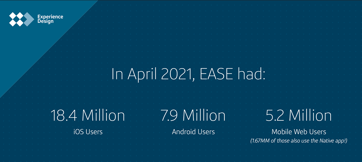
In June 2017, we earned our first of several J.D. Power Awards. The Android app received excellent reviews in the Play Store and was contributing to overall company revenues exceeding $7 billion annually. As our impact grew, so did our team. We expanded from two to five designers and from four to ten development teams.
In 2019, the Flagship Mobile Team underwent a major restructuring and was federated. Native design work was transferred to line-of-business designers who had previously focused solely on web. Naturally, this created a significant knowledge gap.
To bridge this, I reworked our Android Design System Library, ensuring it covered all possible variations across products and improving its overall usability. I also refined its structure to make it more intuitive and efficient for new designers transitioning into native app work and hopefully set them up for success.
Retrospective
My time at Capital One was deeply formative. I grew in every direction, craft, collaboration, leadership, and resilience.
I joined a company just beginning its journey into native mobile, and left having helped scale a design system, influence platform thinking, and launch one of the most-used financial apps in the country. I learned how to work across
regions, with distributed teams and evolving org structures. I also learned when to lead, when to partner, and when to push back.
Capital One gave me room to experiment and support to improve. It shaped the kind of designer and teammate I am today. It will always feel like a second home.